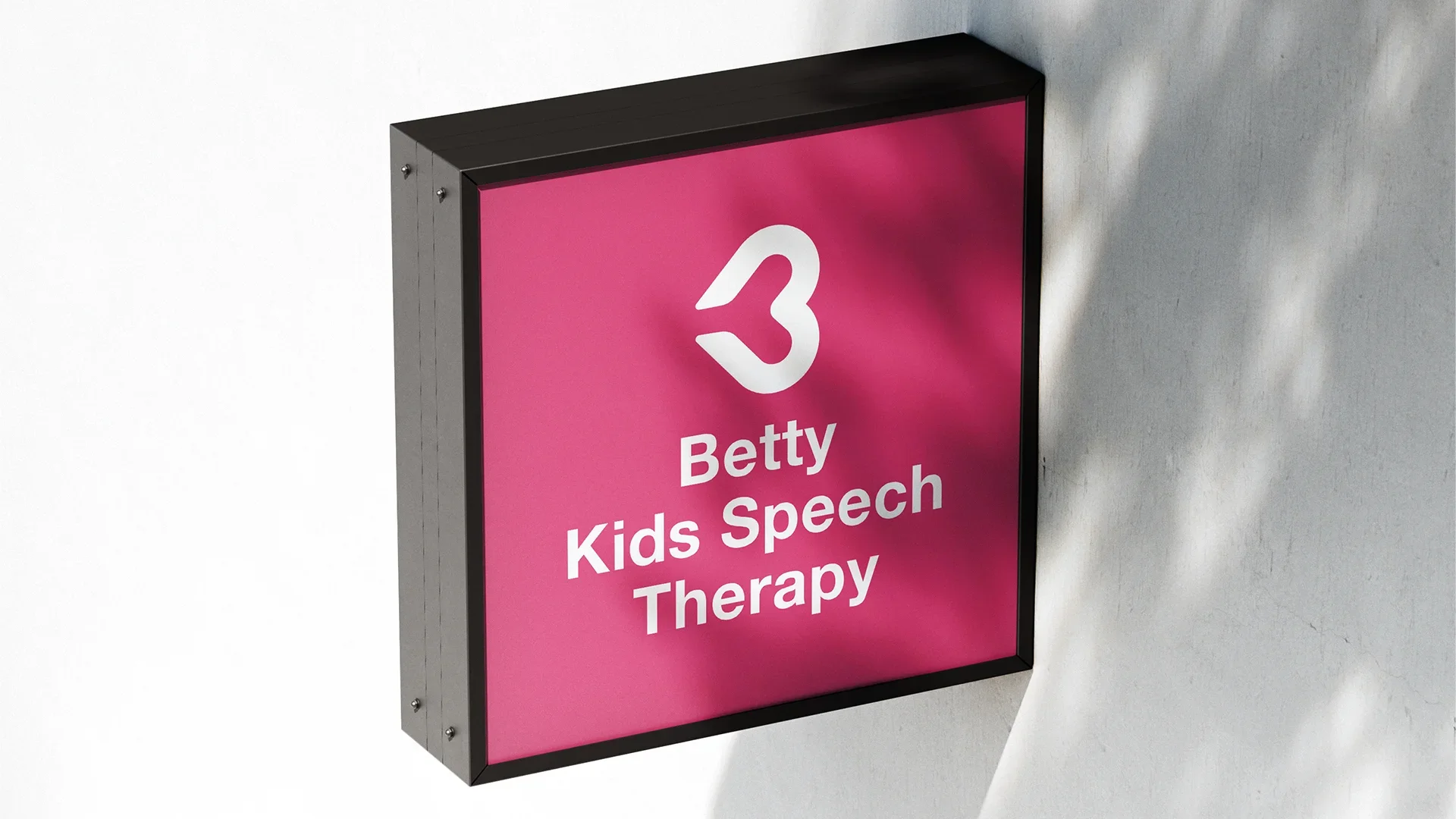
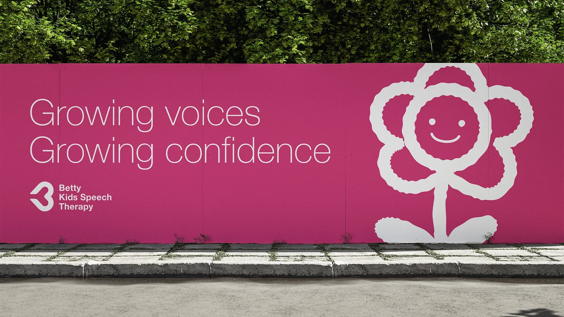
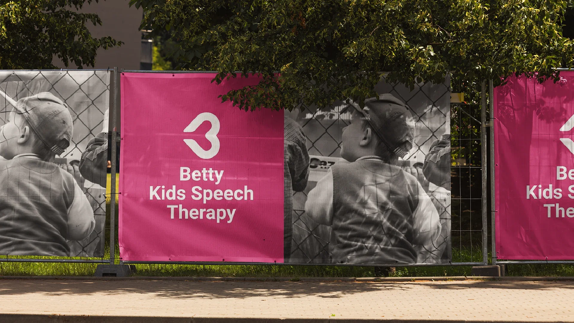
2024 — Brand Identity
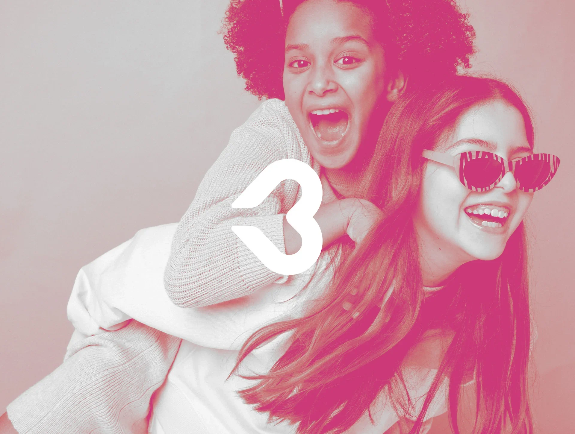
Betty Kids Speech Therapy is a brand designed to communicate care, confidence, and growth. The visual identity was developed to reflect the mission of the clinic: helping children find their voice and build the confidence to express themselves. The branding combines warmth, simplicity, and clarity through a vibrant color palette and a friendly graphic language that resonates with both children and families. The symbol — inspired by a playful flower with a smiling face — represents growth, voice development, and emotional support throughout the therapy process.
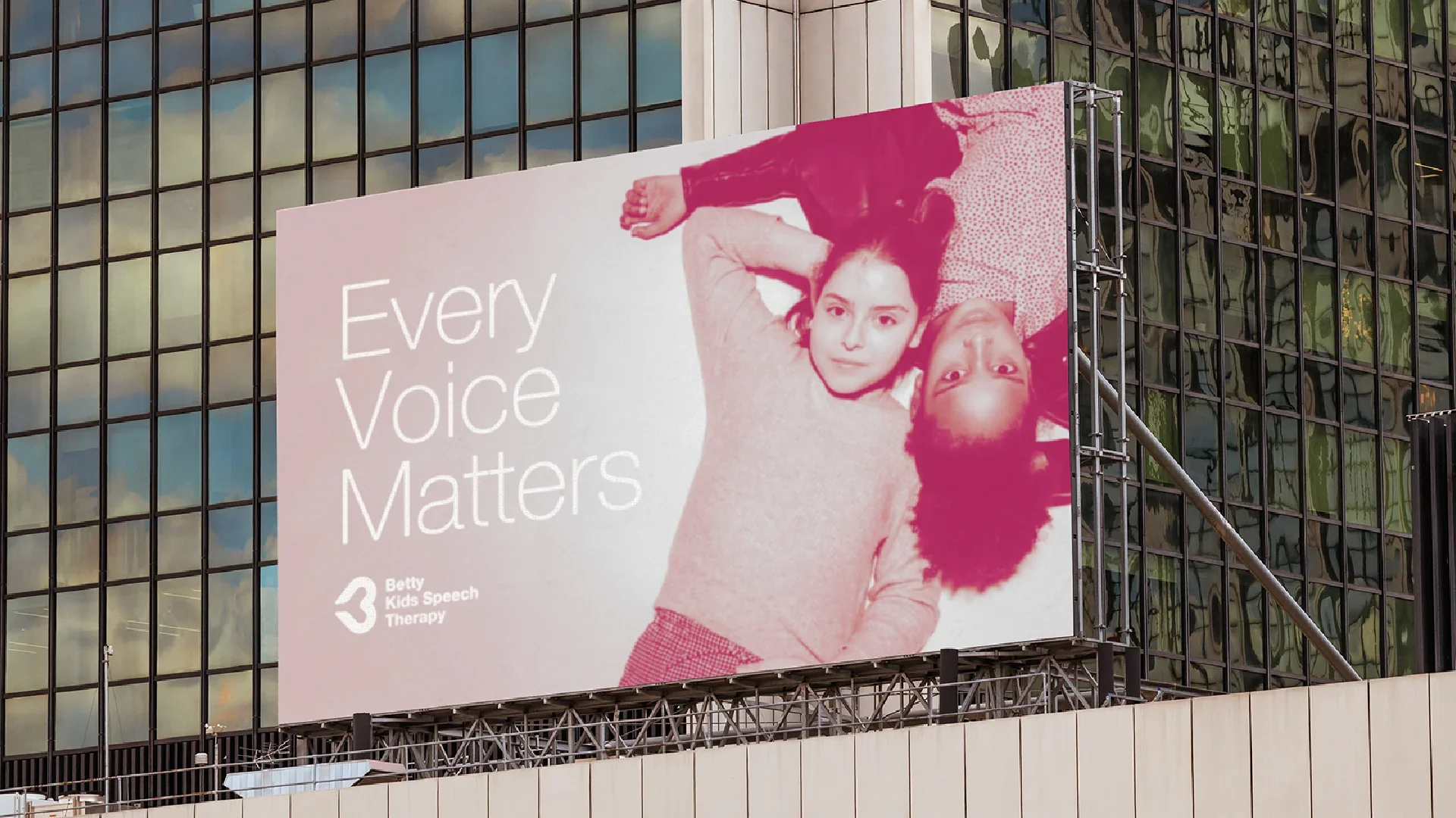
The communication system extends across signage, outdoor advertising, and digital applications, creating a recognizable and welcoming presence in the urban environment. Large-scale visuals and clean typography reinforce the message that every child’s voice matters.
Betty Kids Speech Therapy stands as a modern healthcare brand where design, empathy, and communication work together to support children’s development and empower families.
Betty Kids Speech Therapy